
According to the 2021 SANS Cyber Threat Intelligence (CTI) Survey, 66.3% of companies use open sources to collect indicators of compromise and try to work with multiple sources simultaneously. It would seem that collecting indicators from open sources is a fairly simple task: you just need to download a txt or csv file from some web-site, and that’s it. In fact, there are many problems along this way. In this article, we will tell you what these difficulties can be, what the structure and format of the feed depend on, what metrics help to evaluate the usefulness of feeds, and also show what you can learn from the feed using a real example.
What are the pitfalls of open source TI
Let’s make a reservation right from the beginning: you cannot bypass problems when you are working with indicators from open sources. At the first loading of such indicators into security tools, you will receive thousands of positives per day. If you don’t even analyze the first 100 hits, you will most likely spit on this issue and just turn off the feed.
Let’s try to describe the main problems that will need to be resolved when collecting indicators from open sources:
- Sources selection
Do not chase the number of indicators in the source and choose those with the most indicators. Do a random check of some indicators from the feed, evaluate them in terms of the quantity of false positives.
- Understanding the feed structure
It is important to understand what indicators of compromise the source brings. But it is often even more important to collect not only the indicators themselves, but also the context associated with them, if any: timestamps, attribution (who attacks, whom, when, why, why and with what tools?). For example, the context could be information about why a particular IP, domain, url or hash was included in the feed. If it is C&C, then you must understand from what kind of malware, if it is a phishing url, then for what company it is made.
- Aggregation and deduplication
What if multiple data sources provide the same IoCs? Double? What if it’s contradictory? Who to believe?
- Understanding the source changes and keeping the data up to date
Before connecting the source, you need to understand what the indicator disappearance from the source means, how the indicator is updated. Imagine that today the indicator was in the feed, but disappeared tomorrow. What does it mean? Does this mean that the indicator has ceased to be malicious, or does the source simply bring only new indicators and do not include the old ones in the download?
- Understanding the source update schedule
When collecting indicators from open sources, it is important to know not only how changes occur in the feed, but also when and how often they are published. If the source publishes only new indicators every 4 hours, then it is worth figuring out exactly what hours this happens. Otherwise, you run the risk of missing the “communication session” and simply not getting some of the indicators, because no one will re-publish them.
- Cleaning indicators
It is quite normal to see 127.0.0.1, microsoft.com, or SHA256 in open indicators using the regular calc.exe. To avoid false positives, it is necessary to clear the indicators using various exclusion lists.
- Indicators enrichment
Many open IoC sources do not provide them with any additional information. Such information, for example, includes ASN, Whois, Geo-reference, information about open ports, running services, etc. Think about what you might find useful in investigating incidents that may involve indicators and where you can get this information.
- Storage of indicators in security tools
It would be just wonderful if you could load all the indicators collected during the year into security tools and use them for checking on the stream. Unfortunately, miracles in IT and cyber security happen very rarely, and you will only have to store as many indicators using security tools as they can provide without significant performance degradation.
In this article, we would like to understand in more details the structures of feeds and the formats in which they are supplied. This is a rather important question, since when collecting indicators from open sources, you will have to develop your own parsers of files with indicators, and then also utilities for converting already cleaned and enriched indicators into a format that is understandable to the import modules of your security tool.
In general, the feed format is determined based on the data model that needs to be stored. Let’s try to reveal a little more about what we mean by “data model”.
Let’s recall the “Pyramid of Pain”, first proposed in 2013 by David J Bianco.
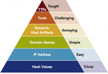
At the bottom of the pyramid are atomic network and host indicators. Usually flat data structures can be used to describe them in the feed by creating a txt or csv feeds. Such structures are characterized by the absence of any nesting.
For example, a feed of such a structure might look like this:
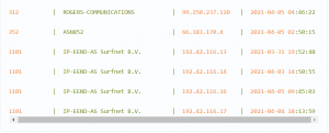
Or even like this:
As you move up the pyramid, you need to describe more and more complex data models. This complication is due to the fact that at higher levels it is not enough to simply describe the atomic indicator and its attributes. The feed should already reflect both bundles of indicators and entire behavioral patterns of malware, techniques and tactics (TTP) of hacker groups or APT stages.
To describe such models, the usual flat structures are no longer enough, and formats such as json, yaml, xml, or something more exotic built on their basis are already involved here. An example of a feed describing several related objects in the STIX 2 format can be found in this article.
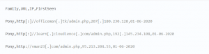
In addition to extreme points in the form of flat structures on the one hand and complex structures with a high degree of nesting on the other, there are intermediate options. Usually such feeds are generated in json format and have a small nesting depth – from 1 to 3 levels. Feeds with this structure appear when atomic indicators provide additional context that allows you to have more complete information when investigating an incident where these indicators occur. Below is an example of such a feed.
Example: What can be learned from the feed?
Let’s take a closer look at what is useful in feeds with indicators provided with additional context, using the example of the structure of a domain indicator.
The feed itself consists of json of the following form:
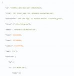
Let’s highlight the key information about the indicator, which can be found in this feed:
- GUID indicator.
- Indicator Brief description – helps TI analyst quickly understand why this indicator is dangerous.
- Time of the first and the last indicator appearance.
- Threat Information carried by the indicator. In this case, the domain is attributed with the SilverFish APT grouping (more details can be found in the researchers’ public report).
- Tags – give additional context. In this case, the malicious domain is used as a command and control server (C2C).
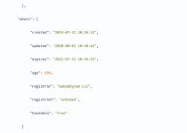
- IP addresses to which the domain resolves – useful when analyzing logs from network devices where only IPs are present and there is no information about the DNS resolution.
- Whois information – helps the TI analyst better understand who registered the domain and when. Often, “one-day” domains are registered for attacks, so it is important to pay attention to when the domain is registered. In our example, the APT grouping approached the issue of choosing a domain for the C2C server more thoroughly and used a domain with more than two years of lifetime.
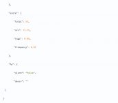
- Indicator weight – allows you to quantify the indicator danger. For example, an indicator with a weight of 70 is more dangerous than an indicator with a weight of 50, and it is necessary firstly react to the appearance of the first one.
- Usually the indicator weight is calculated according to the formula specified by the feed creator. In general terms, it is important for a TI analyst to understand what makes up the final weight. In the above example, the weight of the indicator is made up of the following parameters: trust levels of the indicator sources, its context and frequency of occurrence.
- When working with indicators, it is important to understand how one or another indicator can be a false positive (False-Positive), so there is a corresponding flag in its structure. In this case, the flag is set to false, which means that the presence of such an indicator in the infrastructure with a high degree of probability indicates its compromise level.
What metrics to look at?
Evaluating threat intelligence data is not a trivial task, because ideally, one should not only focus on objective metrics, but also evaluate the relevance of data sources for the specifics of the company or industry, take into account the organization’s unique threat model, and the number of false positive threat detections. This requires a qualitative context in data sources, as well as accumulated statistics. As our observations show, there are problems both with the first and with the second.
So what to do? If nothing is clear, then the best option is usually to start with something small and understandable, in other words, “eat the elephant in pieces”. There are quite a few metrics that can be used to draw a conclusion about the potential benefits of a feed. What should you look at first and why?
Let’s see what metrics can be collected even from “bare” open source feeds, where the context is either absent or it is, but in a minimal amount.
For example, you can evaluate the feed by the dynamics of new data arrival, that is, those indicators of compromise that the feed has not sent before:
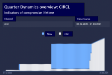
These charts clearly show how often the feed sends new data:
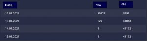
How can such a metric be interpreted? The fact that new data is constantly being received is positive, but an isolated metric is rather ambiguous and should be considered in conjunction with other metrics to see the bigger picture.
Let’s take another look at the open source feed from CIRCL.lu. As you can see from the previous chart, the feed is updated quite regularly. What does it represent, if you look more generally?
For a period of 3 months, there are 157,852 indicators in the feed. You can see that the feed provides different types of indicators of compromise.
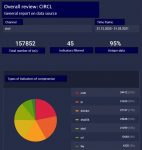
By looking at the CIRCL feed in comparison to several other feeds, one can also evaluate the distribution of IoC types across feeds. What can this information give the user? For example, understanding how such a feed can be used. After all, the abundance of hashes usually requires integration with EDR solutions, it is rather pointless to look for hashes in the traffic flow or netflow from network devices:
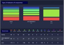
It’s also worth taking a look at the distribution of data across the feature types that feeds provide. Below you can see that some open source feeds provide, in addition to indicators of compromise, that very context: a description of attacks in the form of reports and links to vulnerabilities (CVE). Context in TI is extremely useful: it allows you to understand what kind of threat it is and how to counter it.
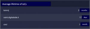
It’s a good idea to take a look at the average lifetime metric for indicators of compromise. It reflects the delta between the time of creation and the time of the last change of the indicator of compromise, averaged over the entire sample (usually it is convenient to look at individual sources). The average lifetime answers the question of how often the TI source updates existing indicators of compromise. Together with the dynamics of new IoCs, this metric allows a more comprehensive assessment of the source: not only how often it sends new data, but also how often it updates existing ones.
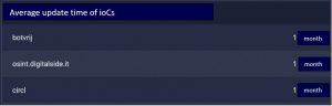
A similar metric could be the average update time, which is the time from the last update of IoCs to the present, averaged over the entire sample. This metric answers the question of how quickly the TI data source provides data on changes to indicators of compromise. Here’s what it might look like:
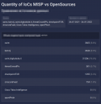
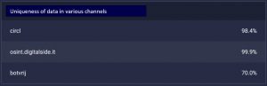
There is an interesting metric that may be taken into account – the uniqueness of data in various sources. The calculation is as follows: for each data source in the sample (set of sources), it is necessary to count the occurrences of the values of indicators of compromise from one source to another. The result is presented in a table below:
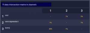
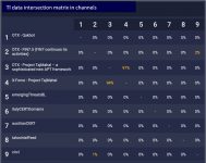
Or, what is even more interesting and clearer, the source intersection matrix. It is usually worth striving to ensure that sources contain the most unique data. If several feeds have a strong intersection with each other, this may indicate that some feed is either an aggregator of other feeds, or one feed drags part of the data from another. Small overlaps are normal – most often this means that some of the indicators of compromise in the feeds are already widely known, and several feeds mention them.
Below are a couple of examples. In the first example, you can clearly see that the CIRCL feed intersects by only 1% and 2% with digitalside and botvrj, respectively, and botvrj – by 30% and 1% with CIRCL and digitalside, respectively (everything is correct here, a different percentage of intersection between botvrj and CIRCL turned out due to their different sizes in terms of the number of objects inside relative to each other).
The second example shows correctly the total intersection between the OTX feeds – Project TajMahal and IBM X-Force Project TajMahal. This is because the feeds tell about the same threat.
Instead of conclusions
We would like to draw a smart conclusion here, but some understatement really asks here for the reason that there is no single way to evaluate the usefulness of feeds using any general set of metrics. For now, you need to evaluate data sources based on the specifics of the industry, the activities of the organization and its threat model, and this is quite painstaking manual work. In this article, we’ve covered some of the most used metrics to get you started in the world of TI.